SELECT WORKS
SELECT WORKS
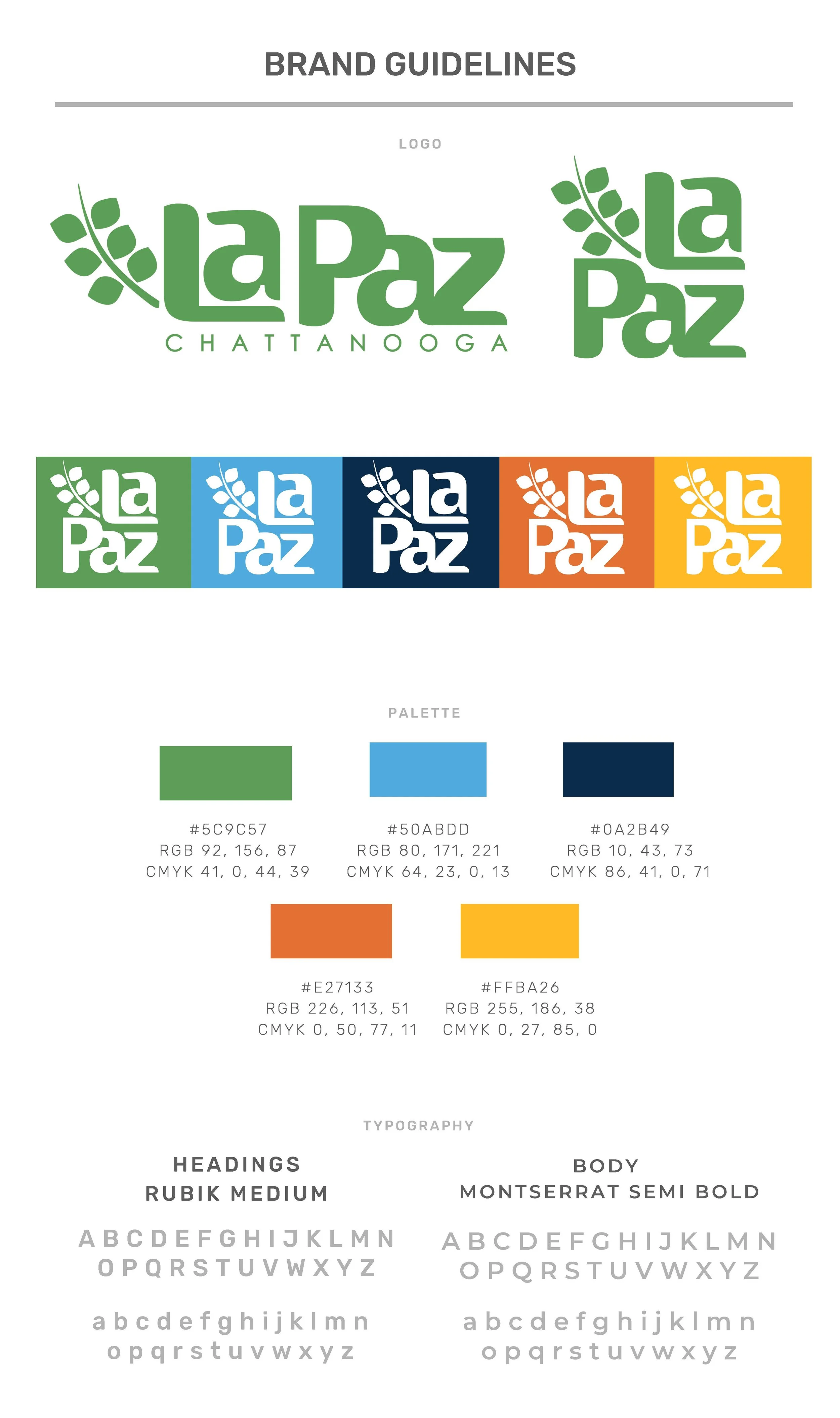
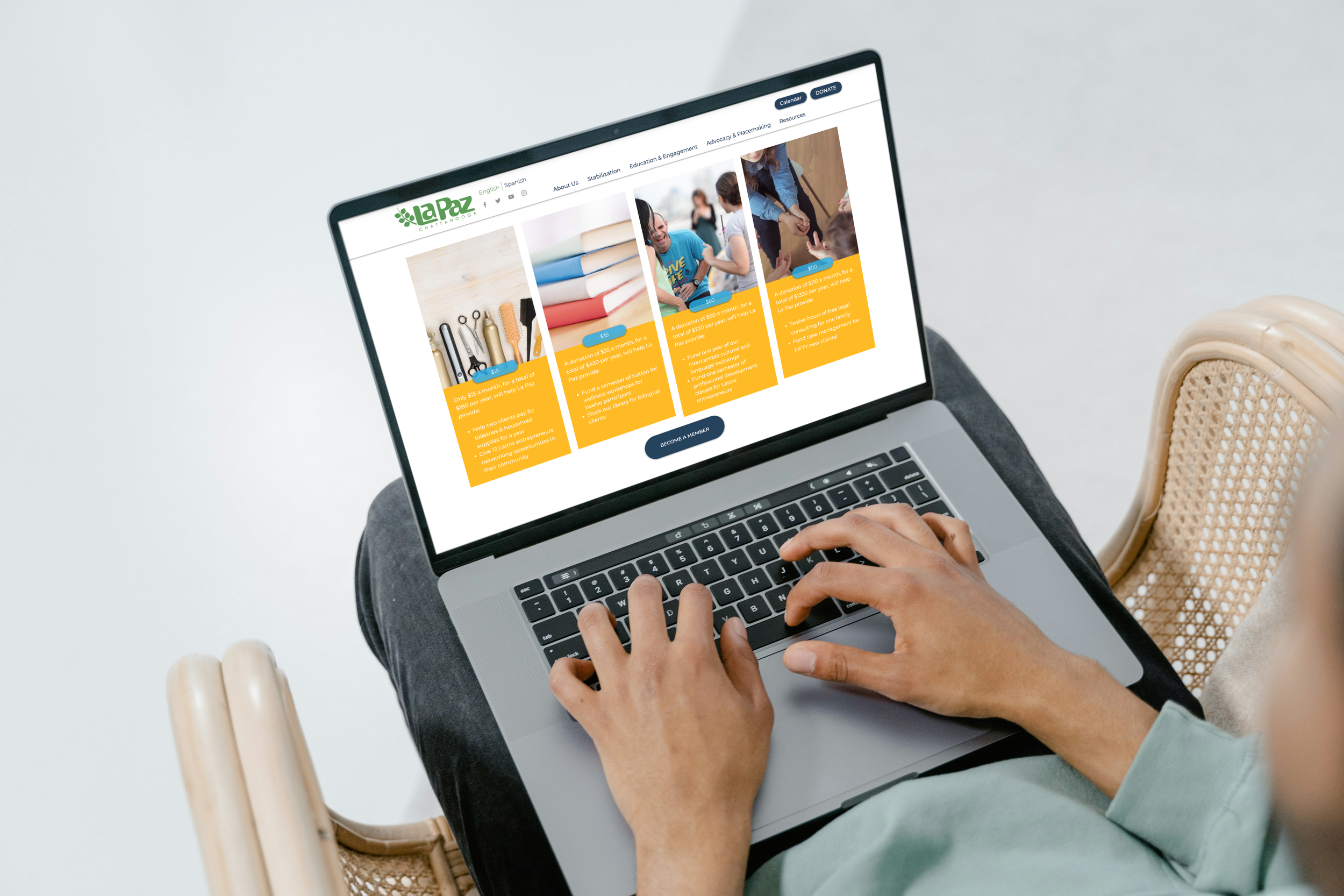
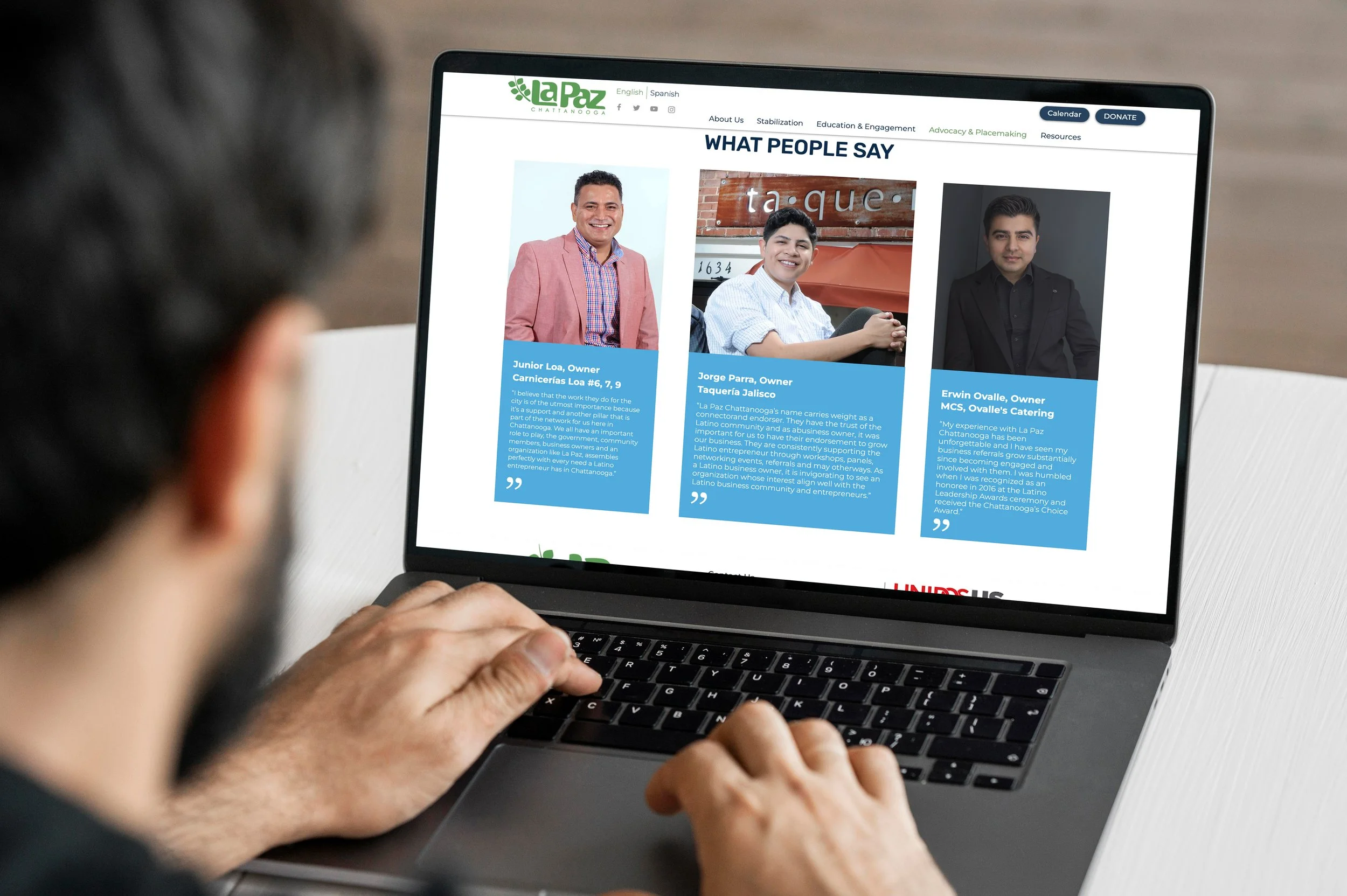
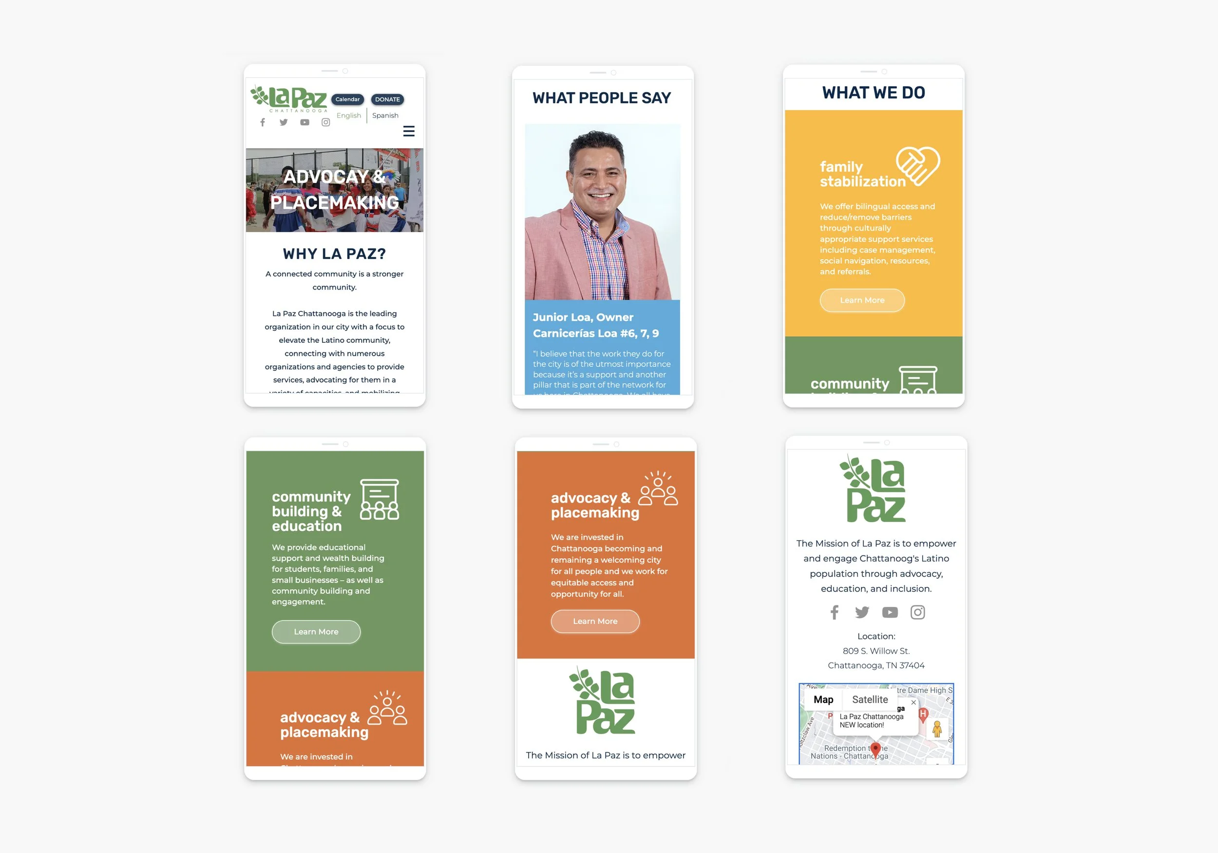
LaPaz
Brand Refinement + Website Design
Working with La Paz, I undertook the task of refining their branding which consisted of a color palette and typography exploration. Another part of my work was redesigning their website to create a visual correlation to their new location and produce a better user experience. I began by gathering inspiration and looking at other nonprofits that also focus on the Latino/Hispanic communities. With the changes made to their brand guidelines I sought to communicate trust, growth, friendliness, and a safe space for all. After quickly learning the software WIX, I began redesigning their website. Upon looking at their previous website, I realized there was a need for an updated look, and areas where information could be better highlighted and user experience improved. I worked on the typography, color palette, footer, buttons, text layout, animation, and image layout. After revisions, the client approved the look of the website. From there, I moved on to the mobile view design, where there were slight adjustments in sizing and layout to correlate with mobile usability.

Original(left) vs New(right) Website

Research
MICRO + MACRO
Print / Poster
I designed a poster inspired by Edward Tufte's essay Micro + Macro, which discusses the underlying complexities of our world. On a day-to-day basis; we often adhere to the macro lens, skimming surfaces, while the micro lens unveils the entirety and the intricate components within. This piece embodies the essence of the design process, a facet usually concealed from the viewer's eye. Micro elements like the foundational grid, imperative in structuring the design, remain hidden, accessible solely to the designer. What viewers encounter is solely the macro perspective—the finalized work. The evolution of numerous sketches and meticulous revisions culminated in an interactive design comprising of two layers. The upper layer, printed on vellum, showcases the tile and grid. The underlying layer features five images and Tufte's essay, inviting an exploration of both micro and macro perspectives.

Final Printed Poster


Final Digital Poster
STATE AND FEDERAL ABSENTEE BALLOT
Forms / Print
The voting ballot is an extremely vital means by which people, for years, have voiced their opinions on government and laws. Consequently, its design plays a pivotal role in enabling citizens to exercise their voting rights effectively. In collaboration with graphic designer Gabriella Gloster, we embarked on an endeavor to revamp various components of the Tennessee Hamilton County Ballot system. Our focus was on redesigning the ballot itself, the mailing envelope, the secure absentee ballot envelope, the return envelope, and the instruction and information sheet. This comprehensive redesign involved analyzing the original forms, addressing prevailing issues, and conceptualizing layout improvements. Our objectives involved enhancing user-friendliness, infusing visual appeal, and introducing a more logically structured information flow in the ballot materials.


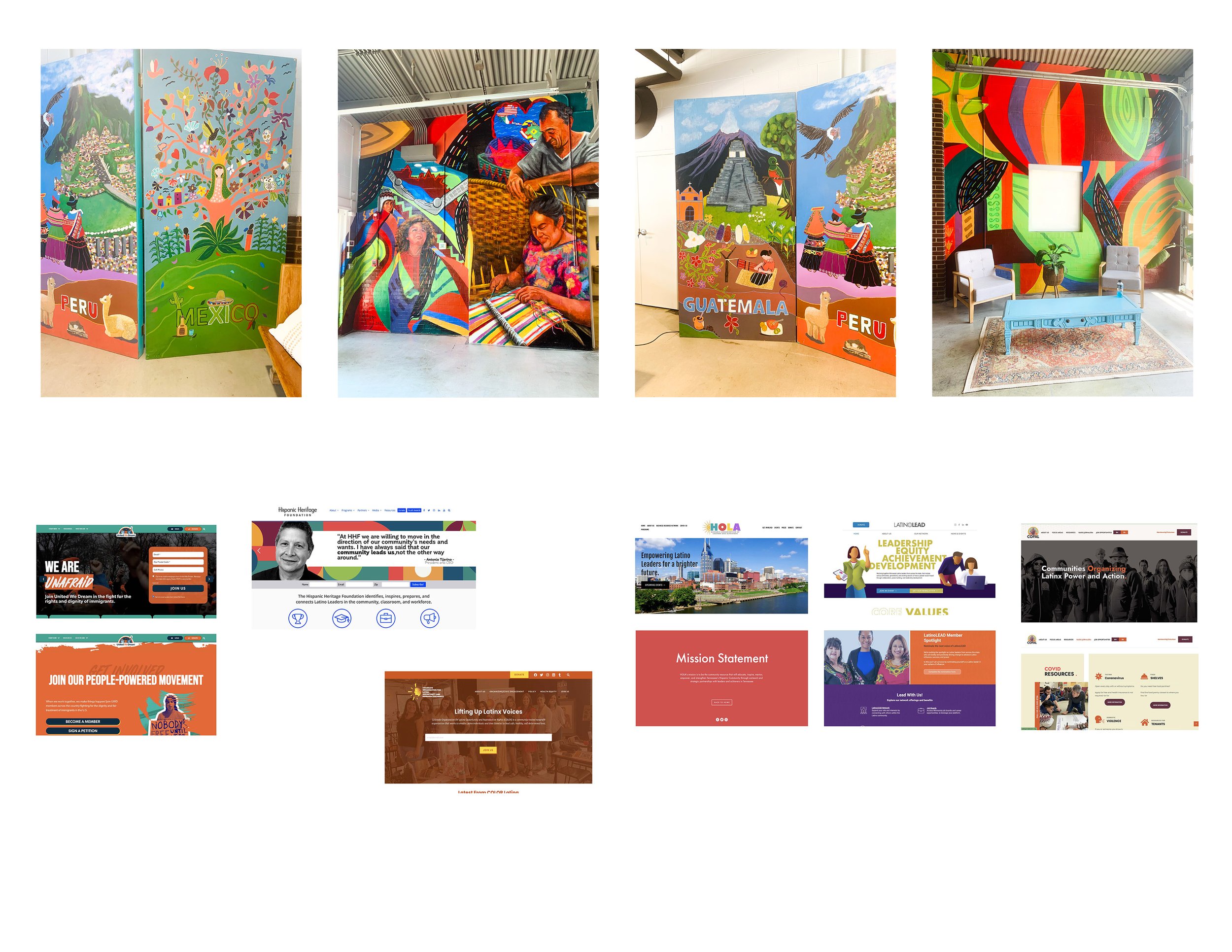
LATINO AMERICA PICTOGRAMS
Assets Design
As assets of a brand's identity, I crafted a collection of pictograms inspired by three Latin American countries: Guatemala, Brazil, and Peru. Creating a geometric and linear style, I ensured a unified visual language across the set. These pictograms were specifically designed for tourist-oriented materials, aiming to illuminate lesser-explored facets of these cultures. The set encompasses three distinct categories: showcasing iconic tourist destinations, celebrations, and the national birds representing each of these Latin American countries.

Final Monochromatic Pictograms

Final Color Pictograms


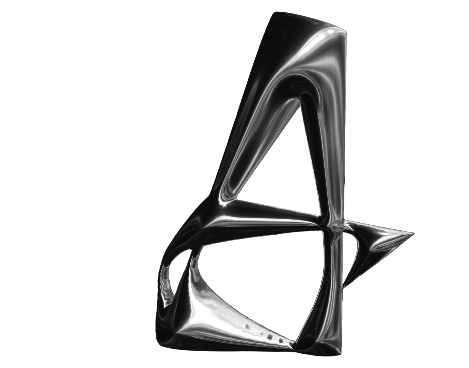
MODULAR TYPE
Type Exploration
I created a modular font influenced by Erwin Hauer's architectural marvels, the Screens of Infinite Continuous Surface. His work drew from the Constructivist Movement, known for its emphasis on simplification, geometric shapes, and humble materials. Through diverse sketches of shapes and form, I crafted various modular interpretations of the alphabet. The resulting modular shapes took form as rounded 3D figures with sharp edges and a sleek metallic texture. My quest then turned to discovering the ideal environment for my typeface to thrive.

Final Modular Typeface

Application of Typeface: Pangram

Application of Typeface: Shoe Brand
