Trust For Public Land: White Oak Park
Way finding + Brand Identity
Creative direction leader, field research, branding, asphalt graphic design, presentation design, and content translation.
Work Includes
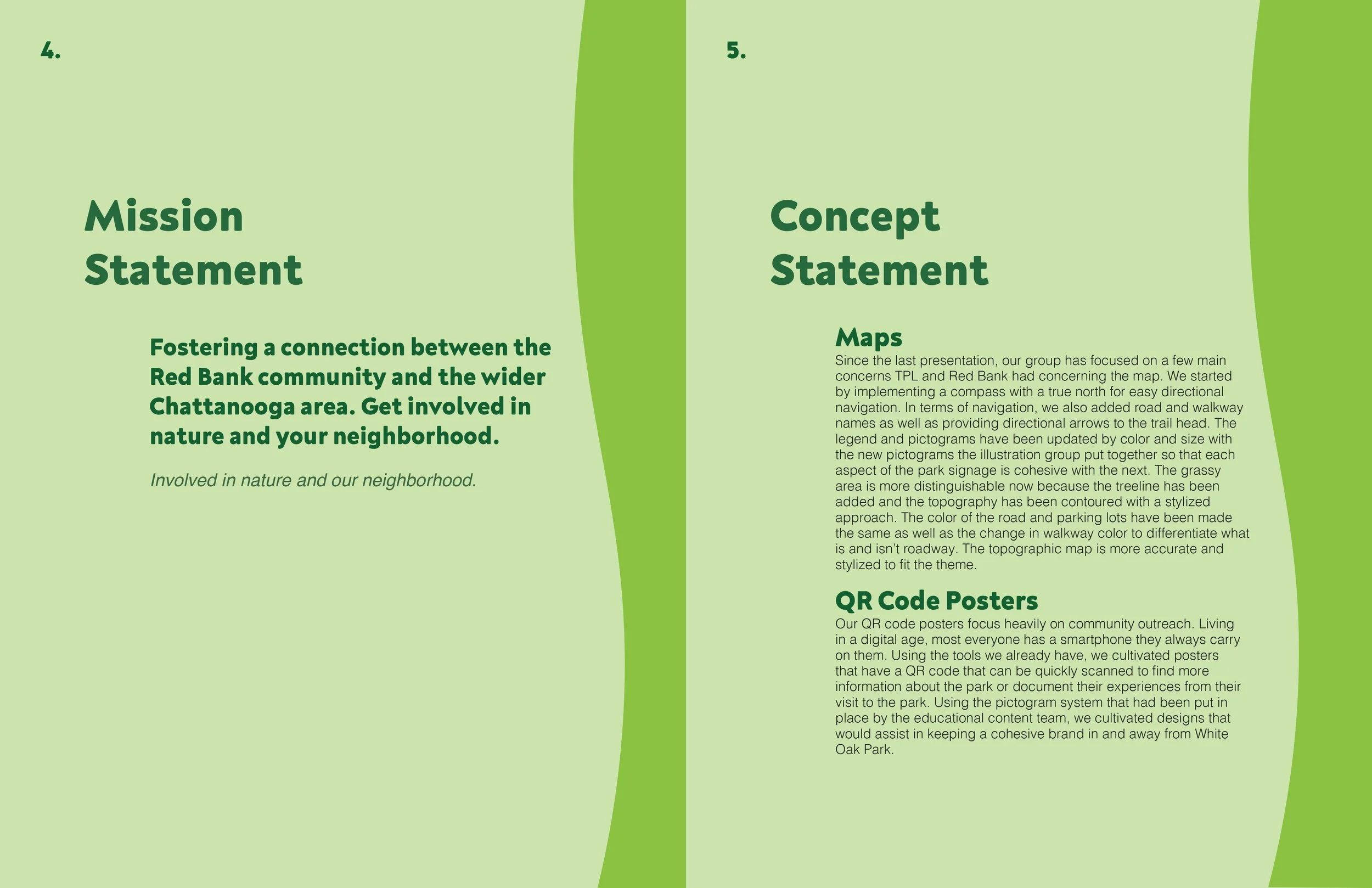
Through collaborative efforts with fellow designers, we established and articulated the distinct brand voice. TPL's mission is to foster a connection between the Red Bank community and the wider Chattanooga area.
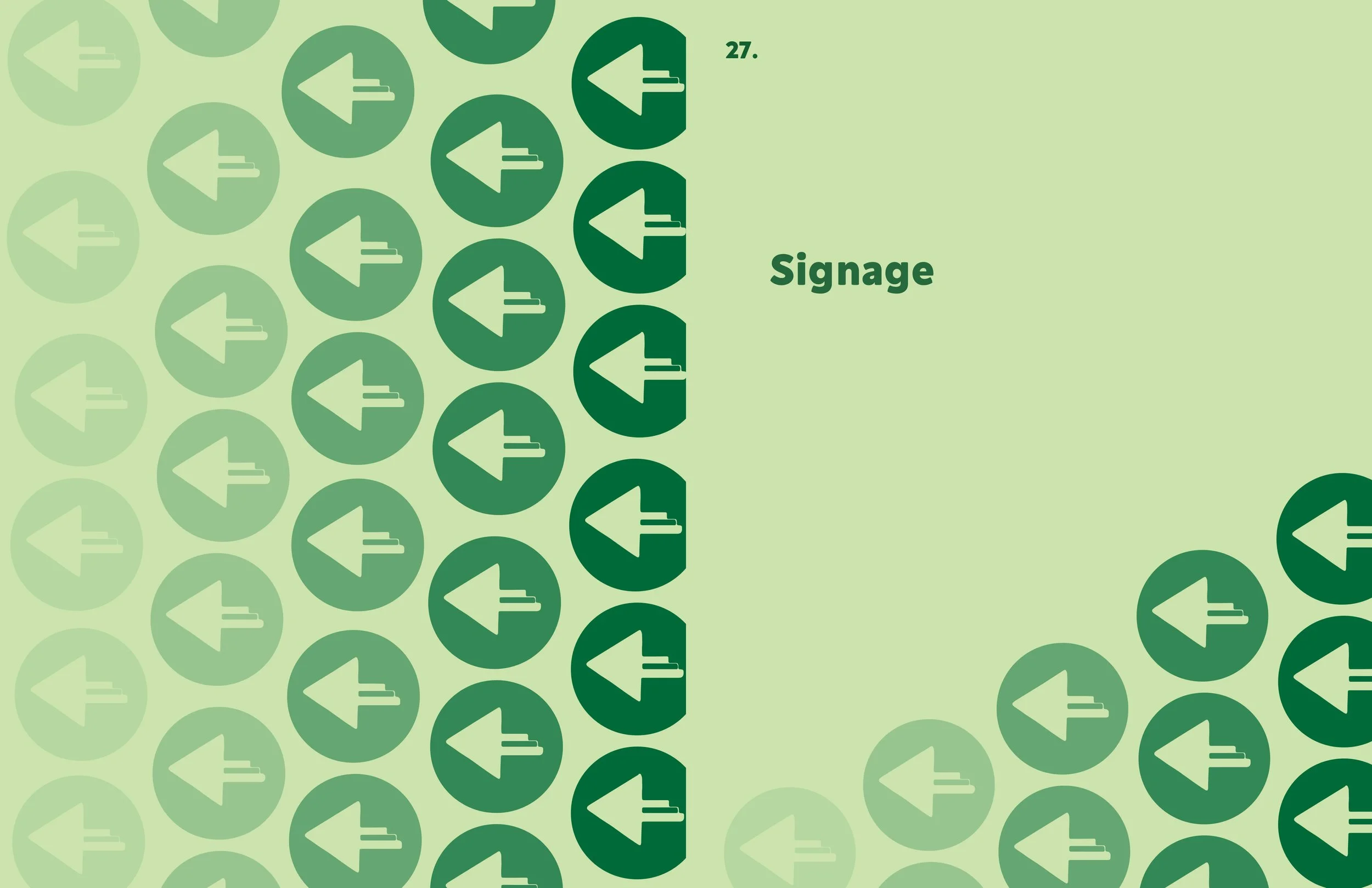
Brand
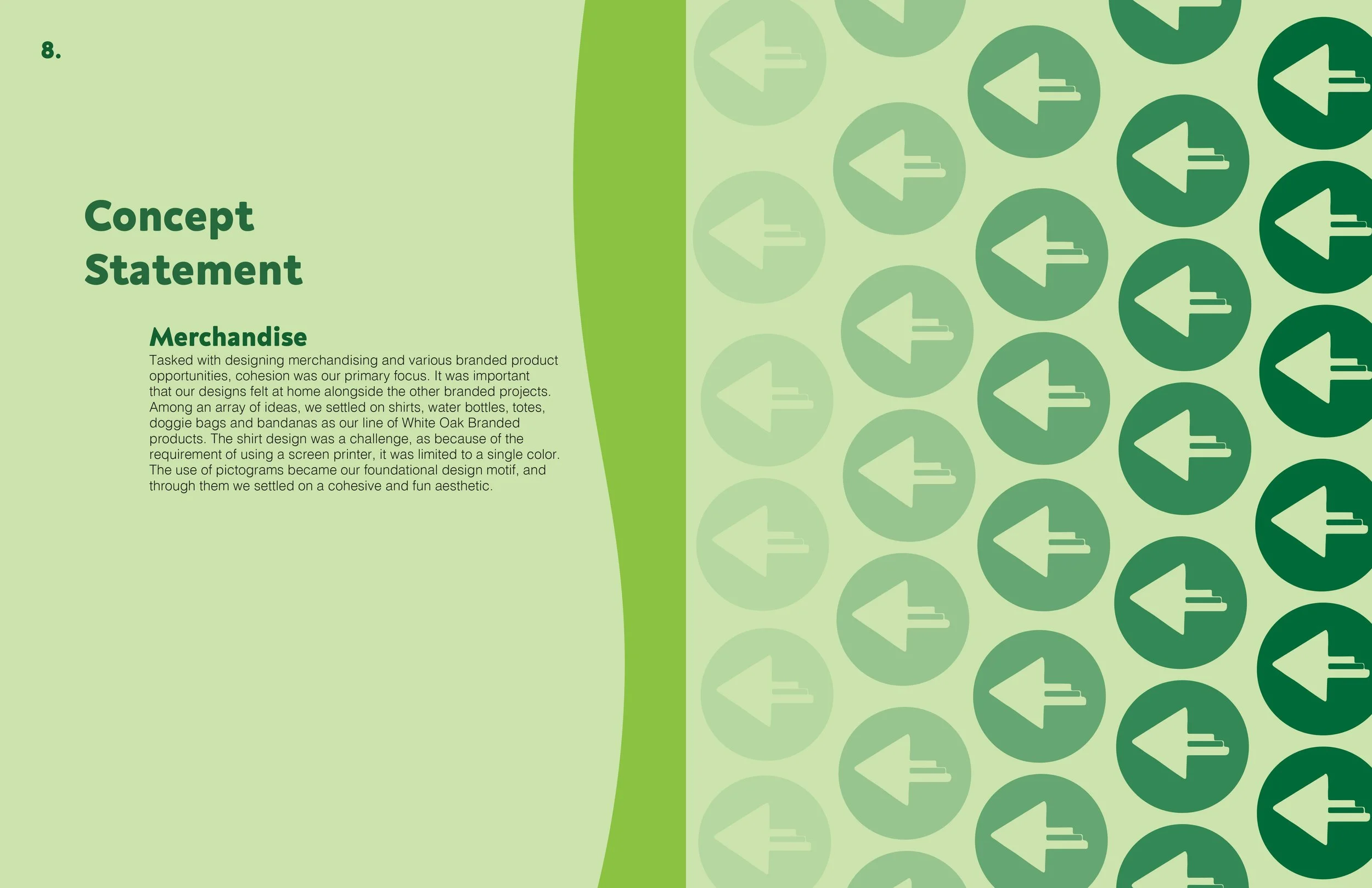
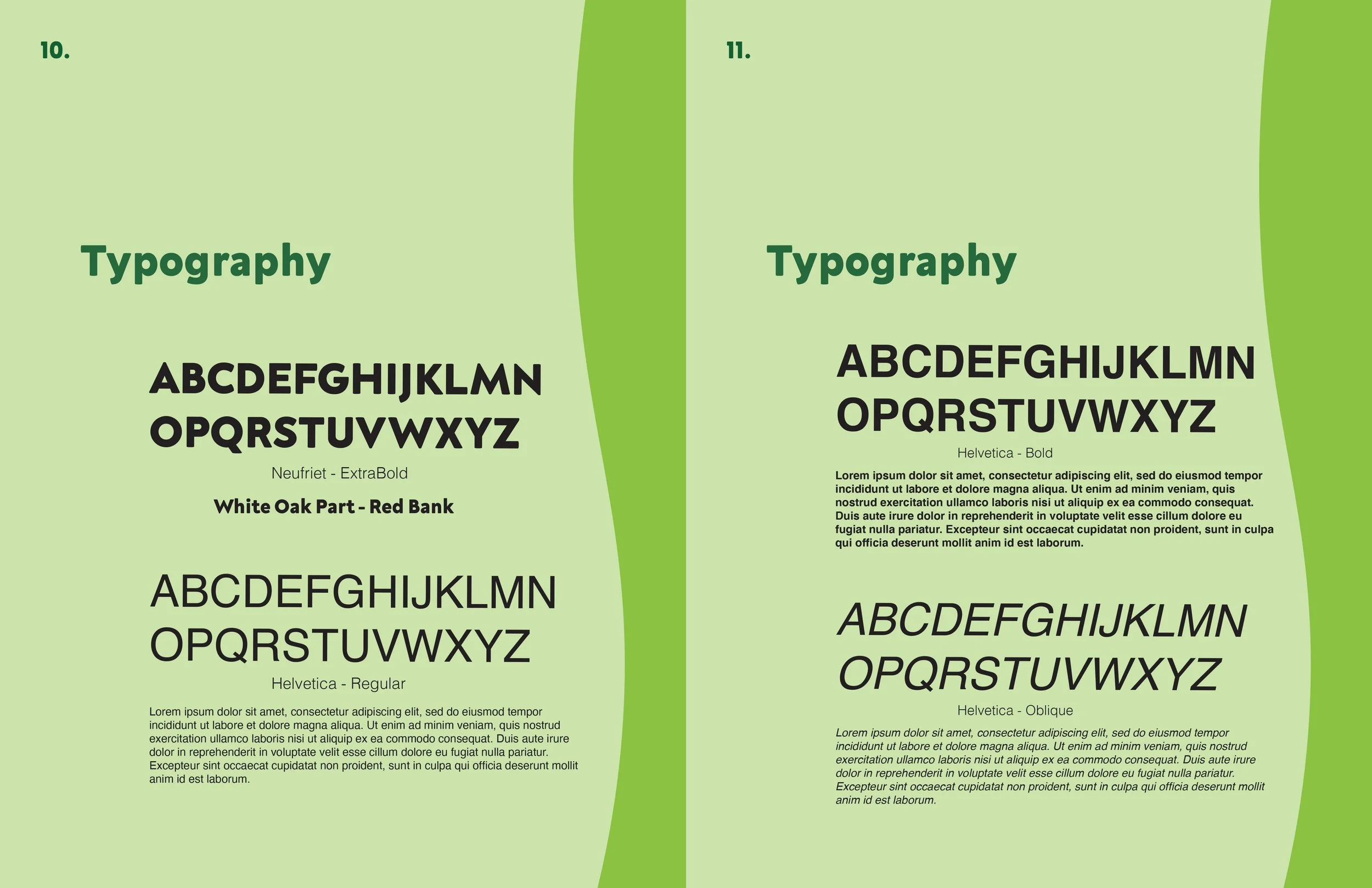
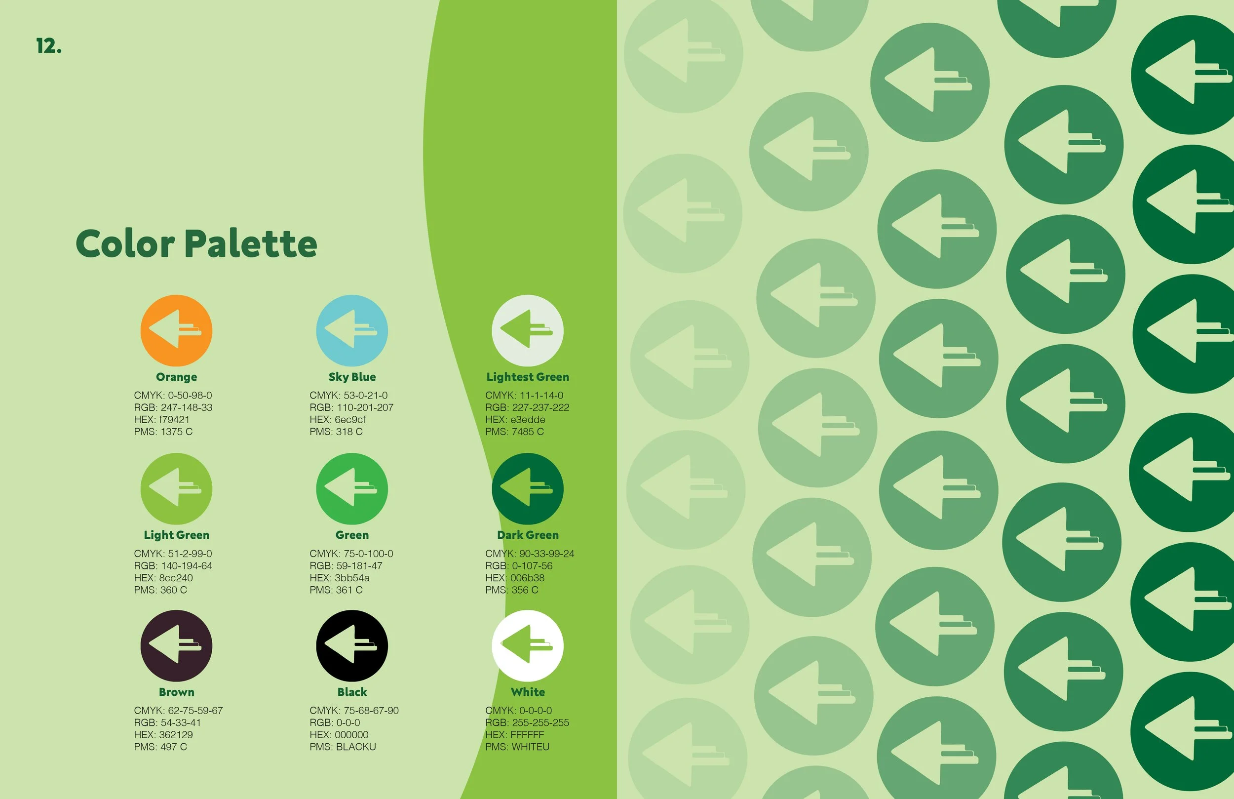
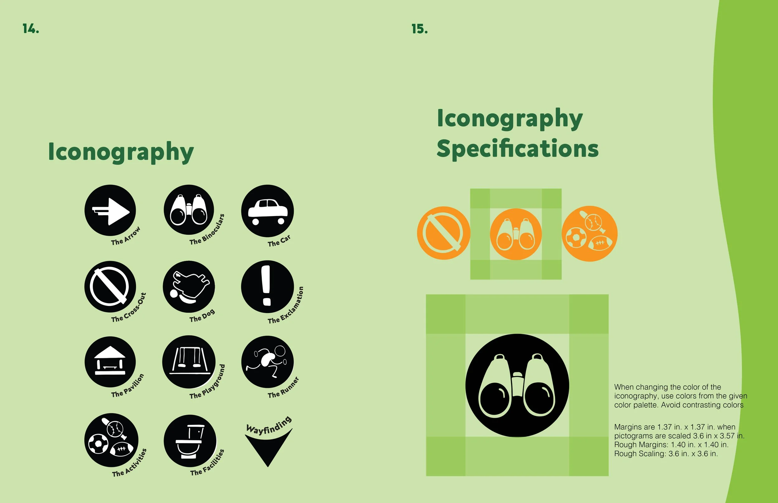
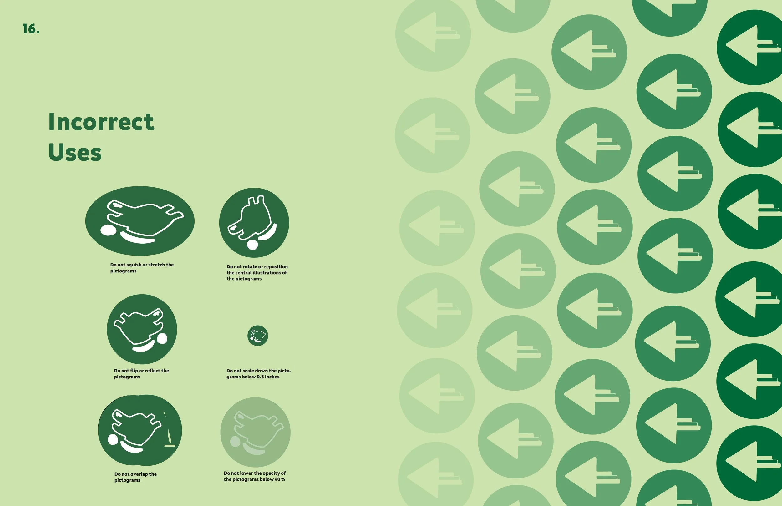
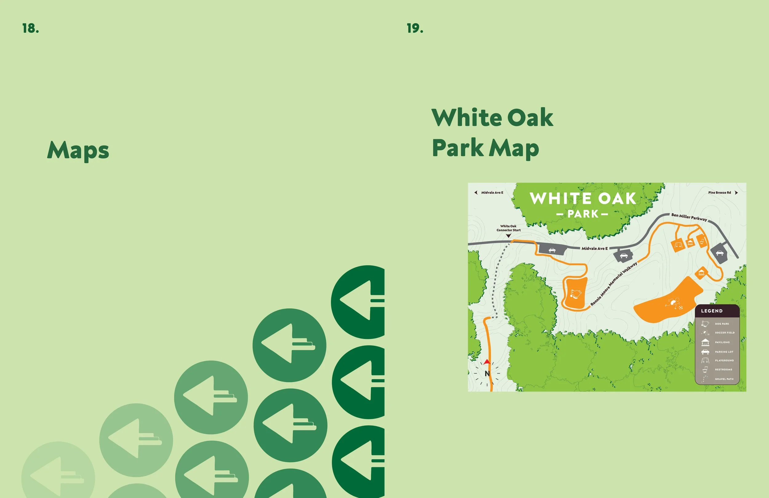
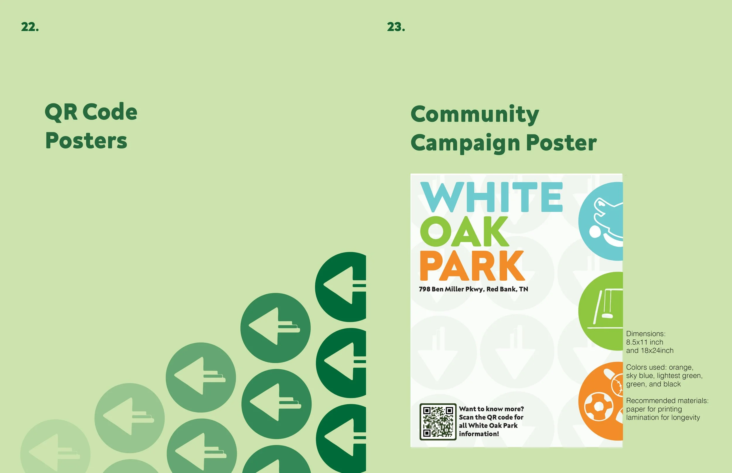
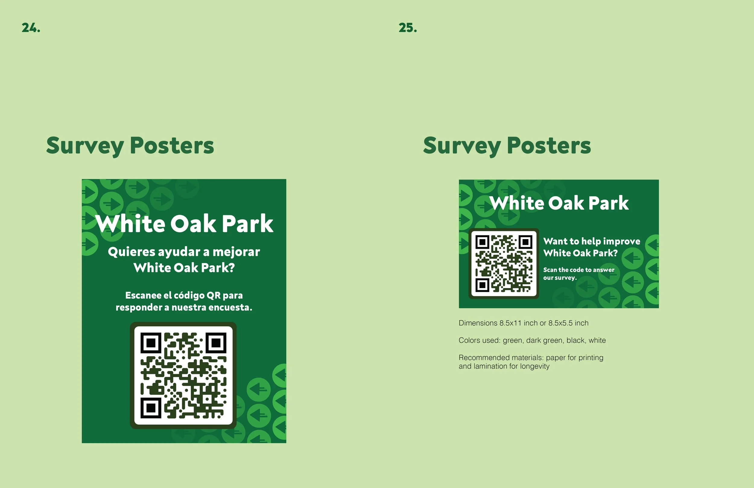
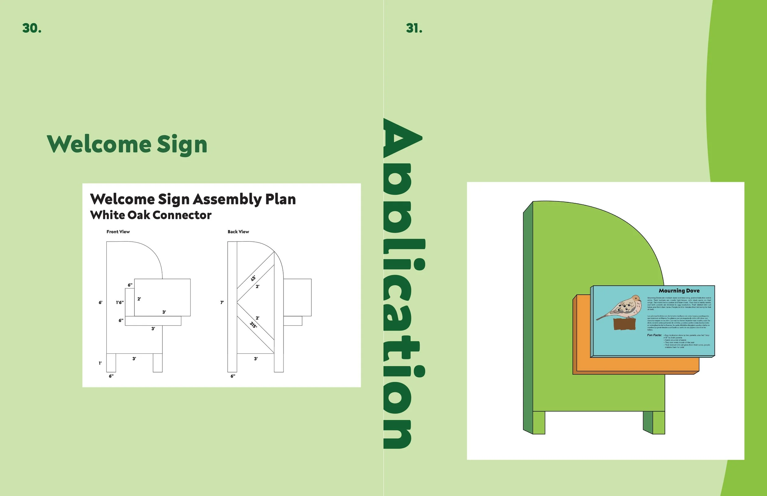
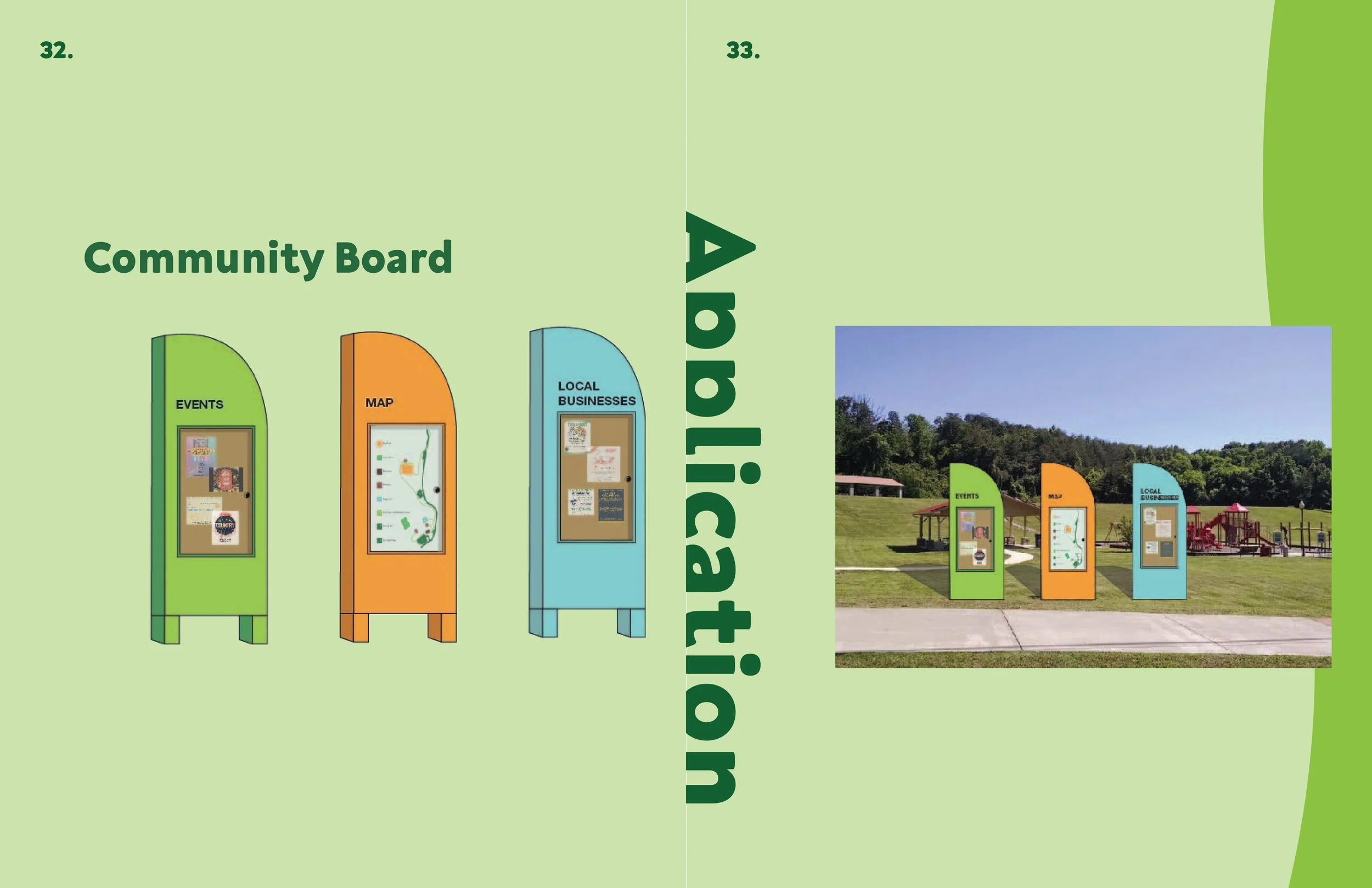
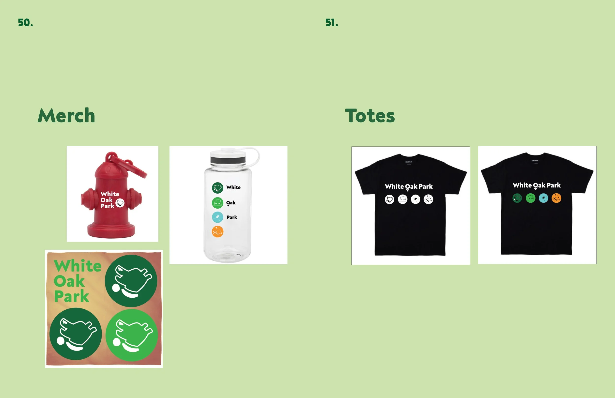
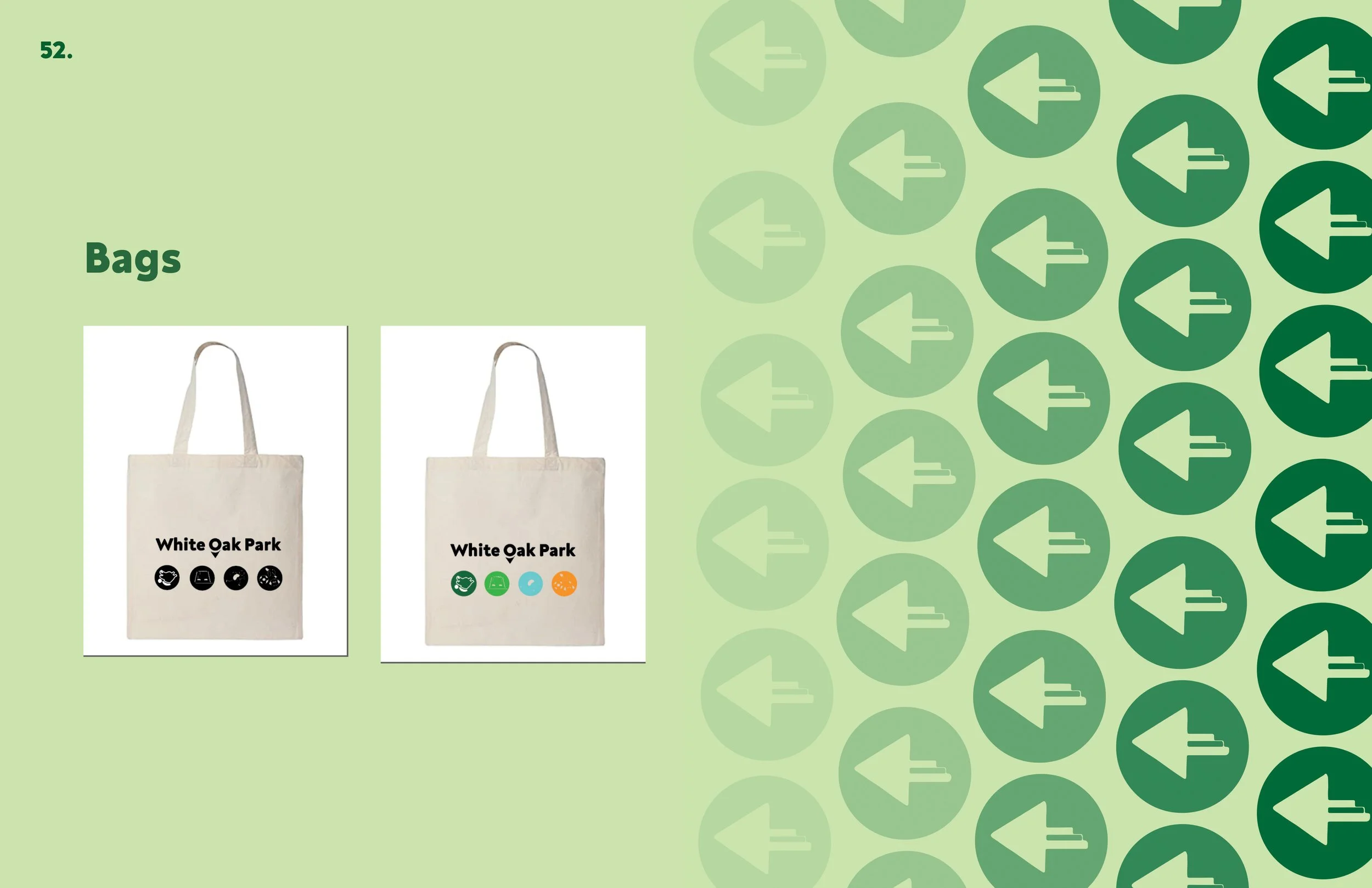
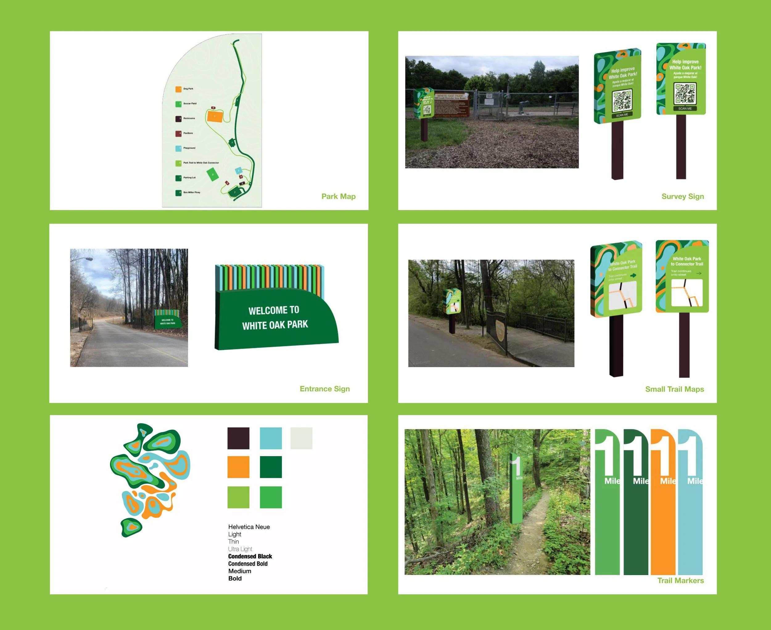
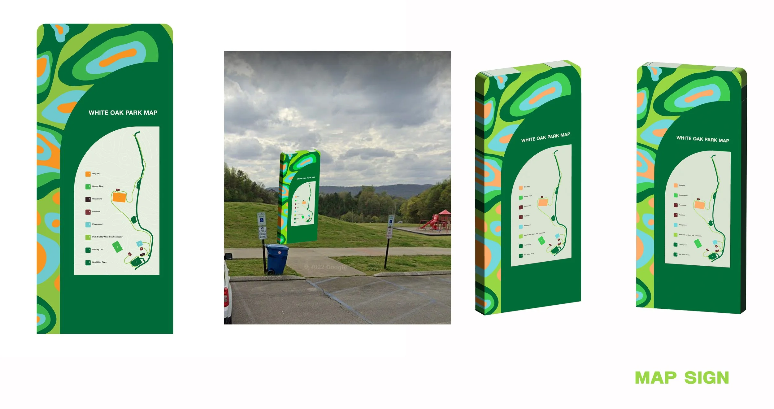
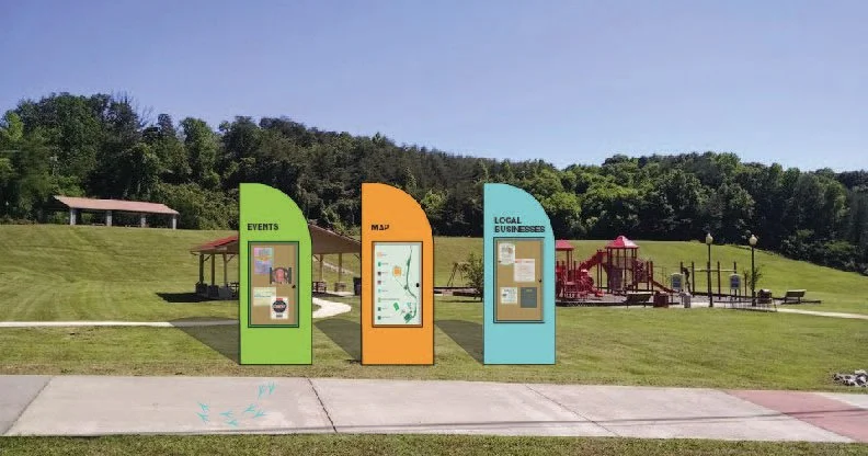
Together with a team of designers, we created a unique brand identity for White Oak Park in Red Bank, a project under Trust For Public Land. Drawing inspiration from TPL's branding, we developed a distinctive identity that flowed across various materials such as signage, asphalt graphics, maps, games, and merchandise. To ensure consistency, we delivered a comprehensive style guide booklet, meant to aid their internal team in effectively communicating the park's brand.
Overview

Inspiration

Initial Sketches
Modern Organic Direction: Designs by the team
Modern Organic Direction: My Designs

Modern Organic Direction: My Designs
Modern Organic Direction: My Designs
Process
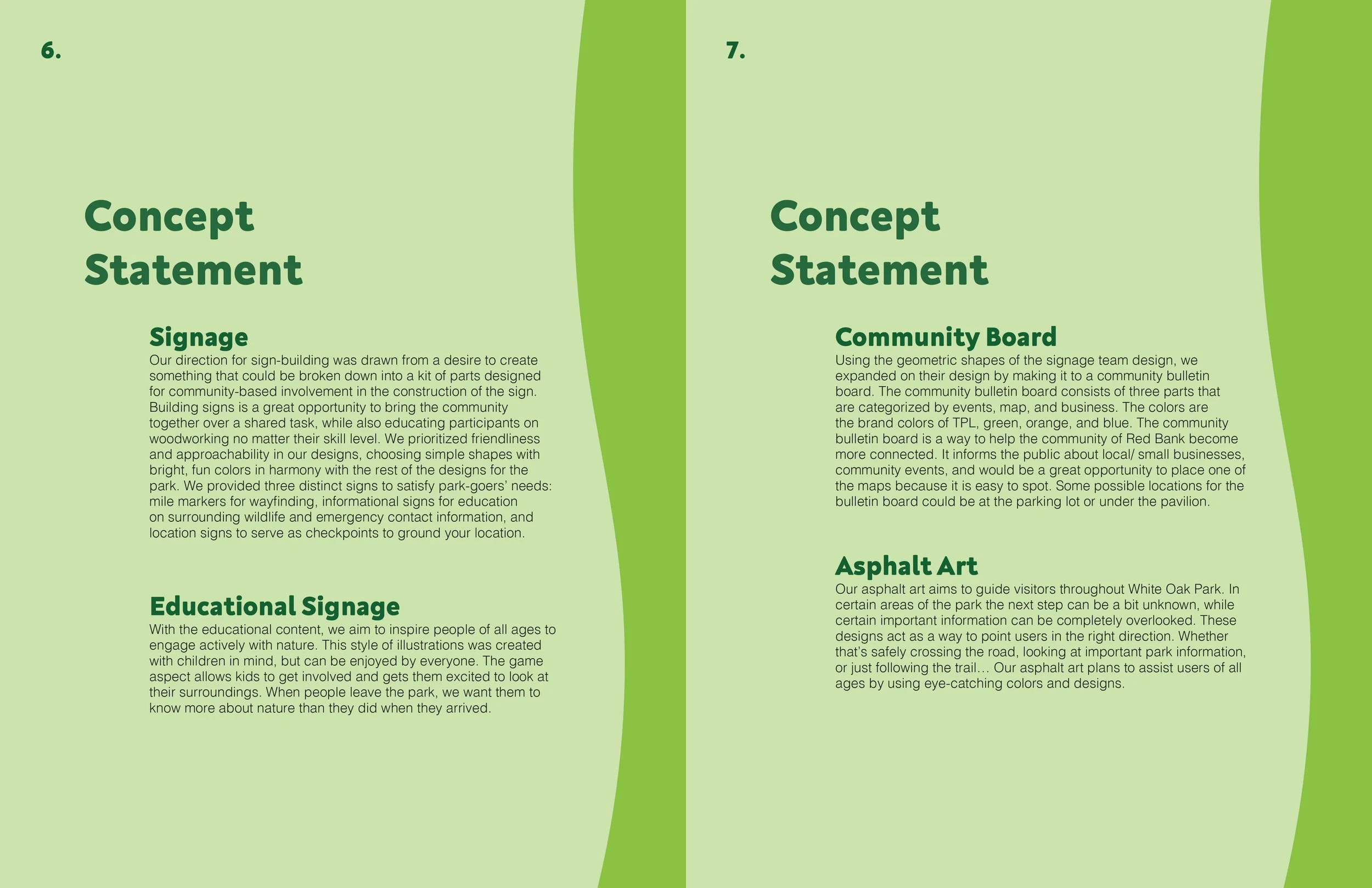
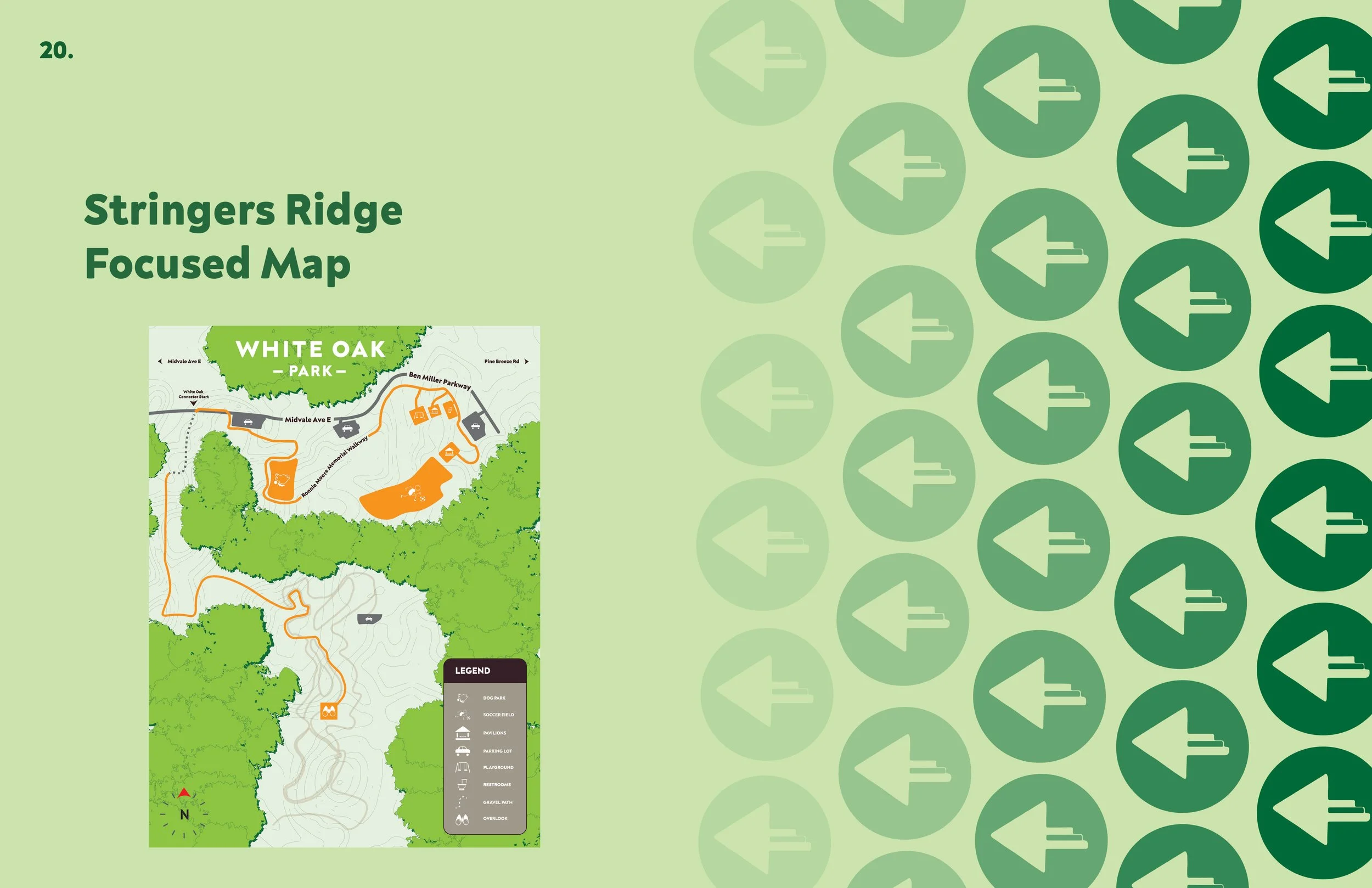
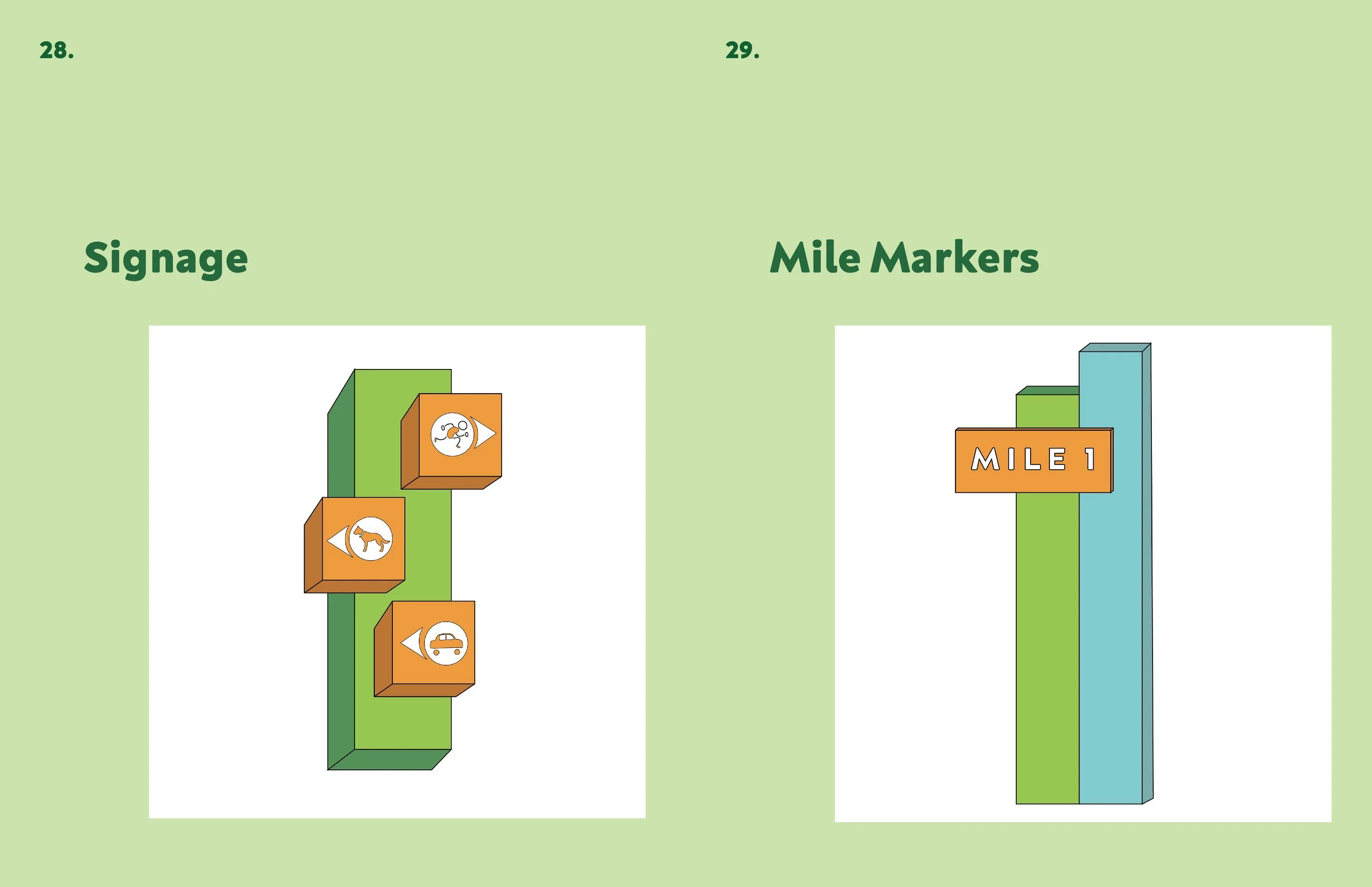
To begin, the design team consulted with the client, TPL, to better understand their work and their vision for White Oak Park. Collaboratively, we identified existing navigational challenges within the park, explored potential solutions, and outlined our objectives. Our design goals were to create clear signage, cohesive visuals, better navigation throughout the park, highlight the connector, and create brand awareness. We presented the client with three distinct design directions. As the Modern and Organic direction team leader, I oversaw that each person was assigned a particular element of the wayfinding, to design. As a team, we shared in-progress work and provided each other with feedback to create a cohesive and distinct visual identity. Following the presentation of the three design directions, our emphasis shifted to the Community and Environmentally Friendly design direction. Organizing into distinct groups once more, we efficiently distributed responsibilities. Within this structure, I actively contributed to the development of the asphalt graphics, offered insights to the maps team, and took charge of translating our informational content from English to Spanish.


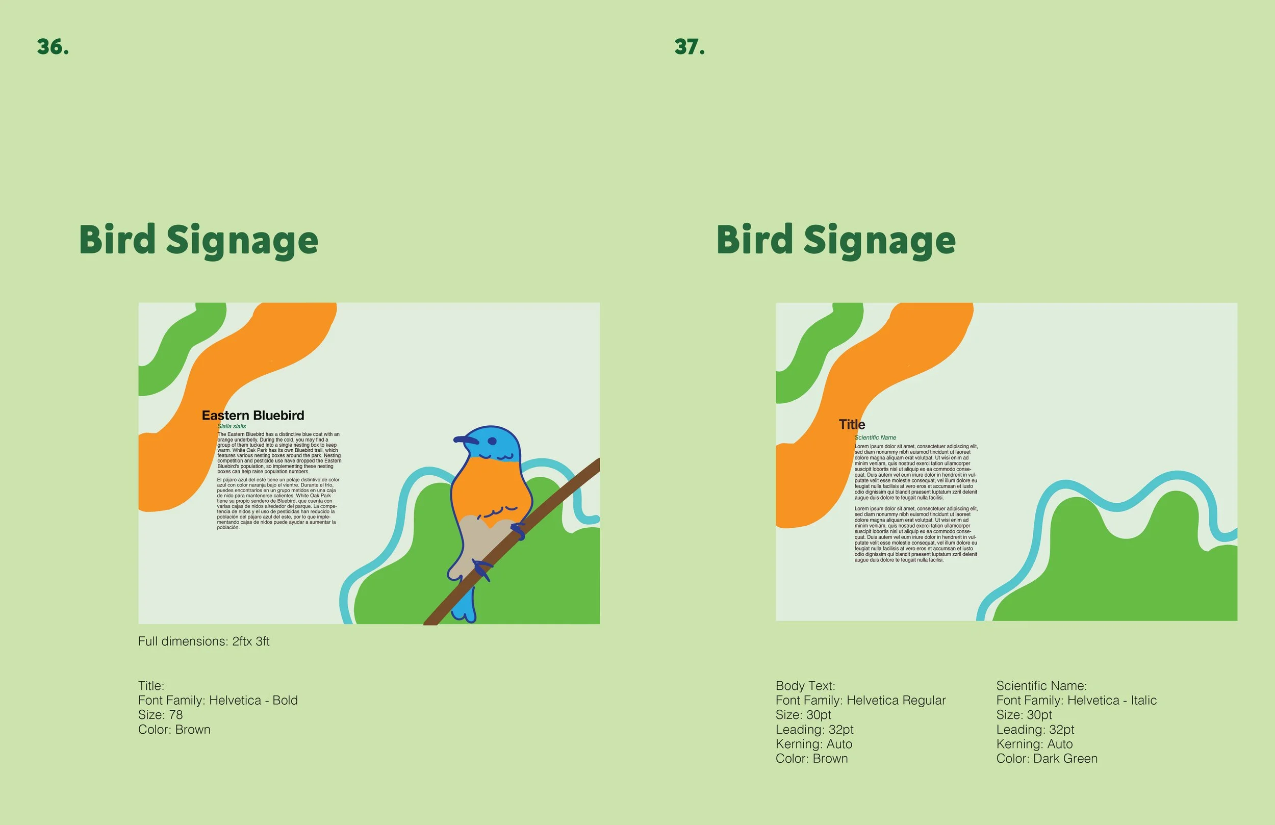
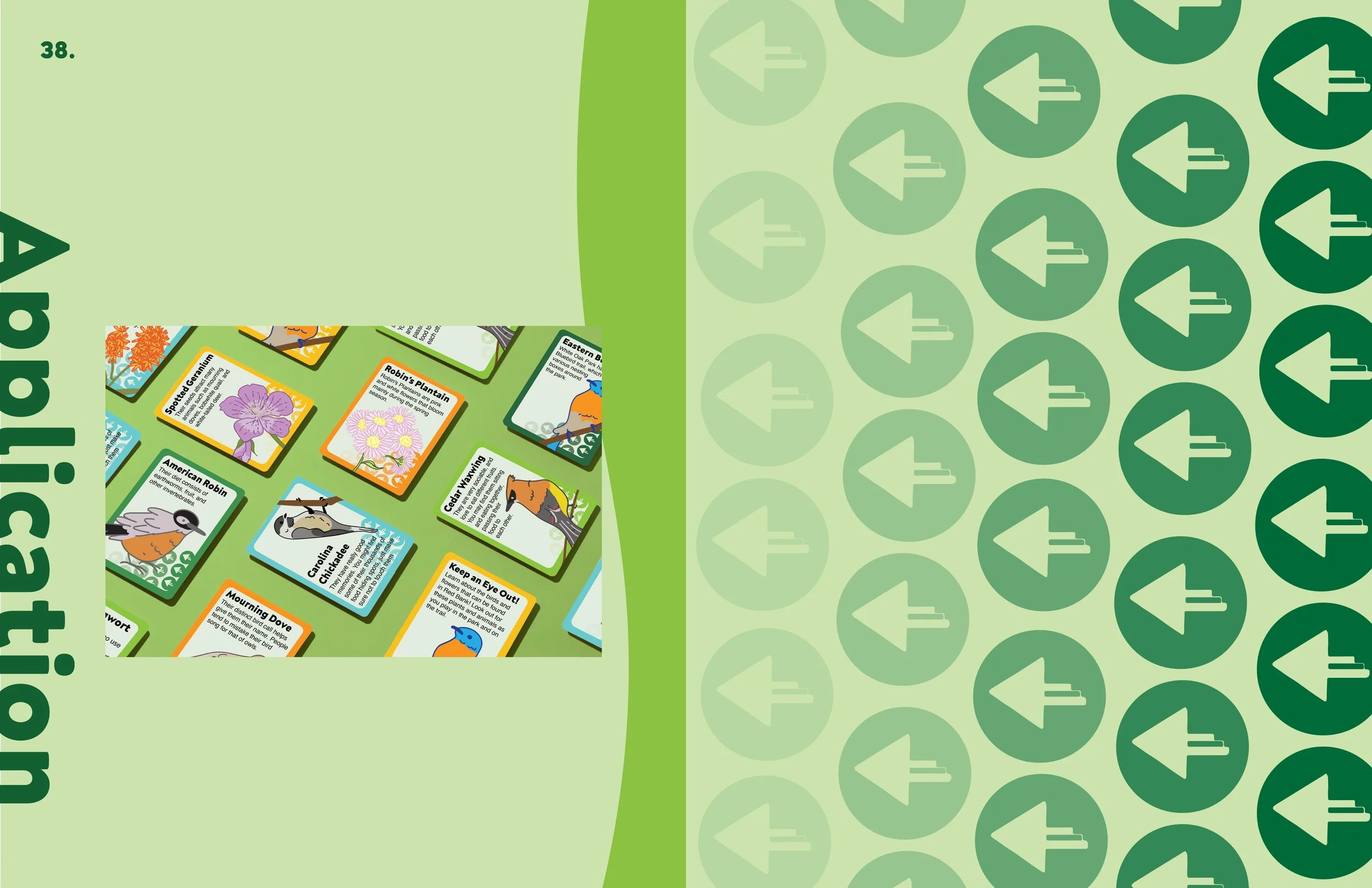
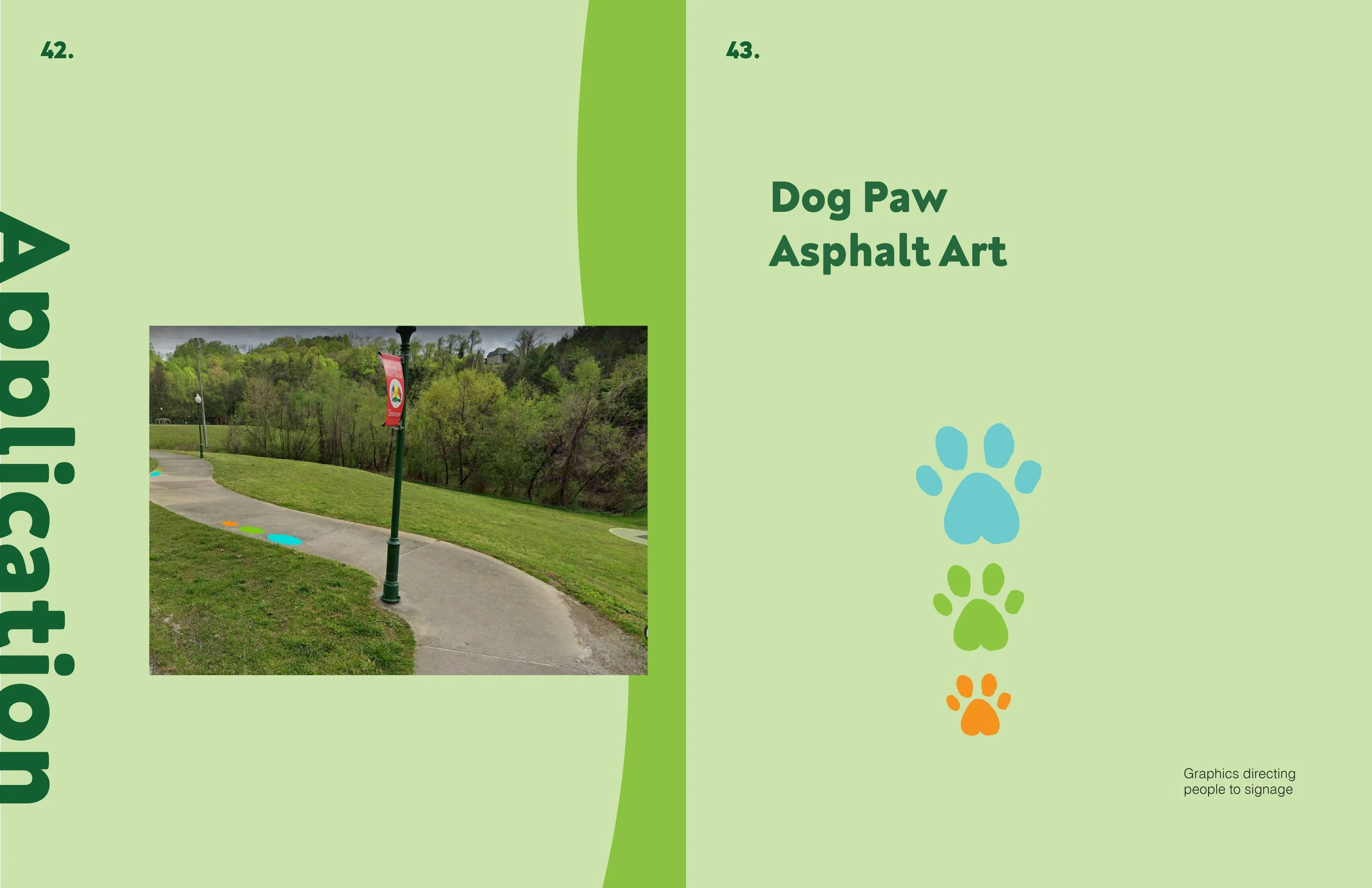
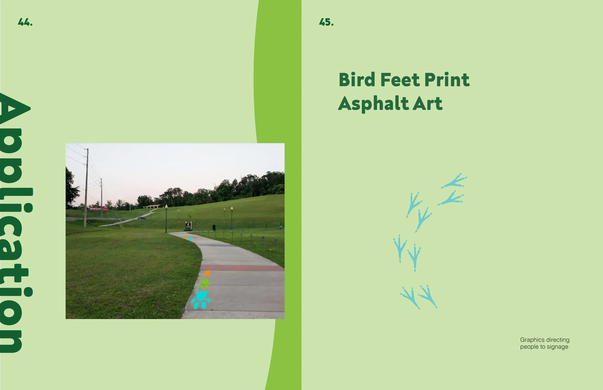
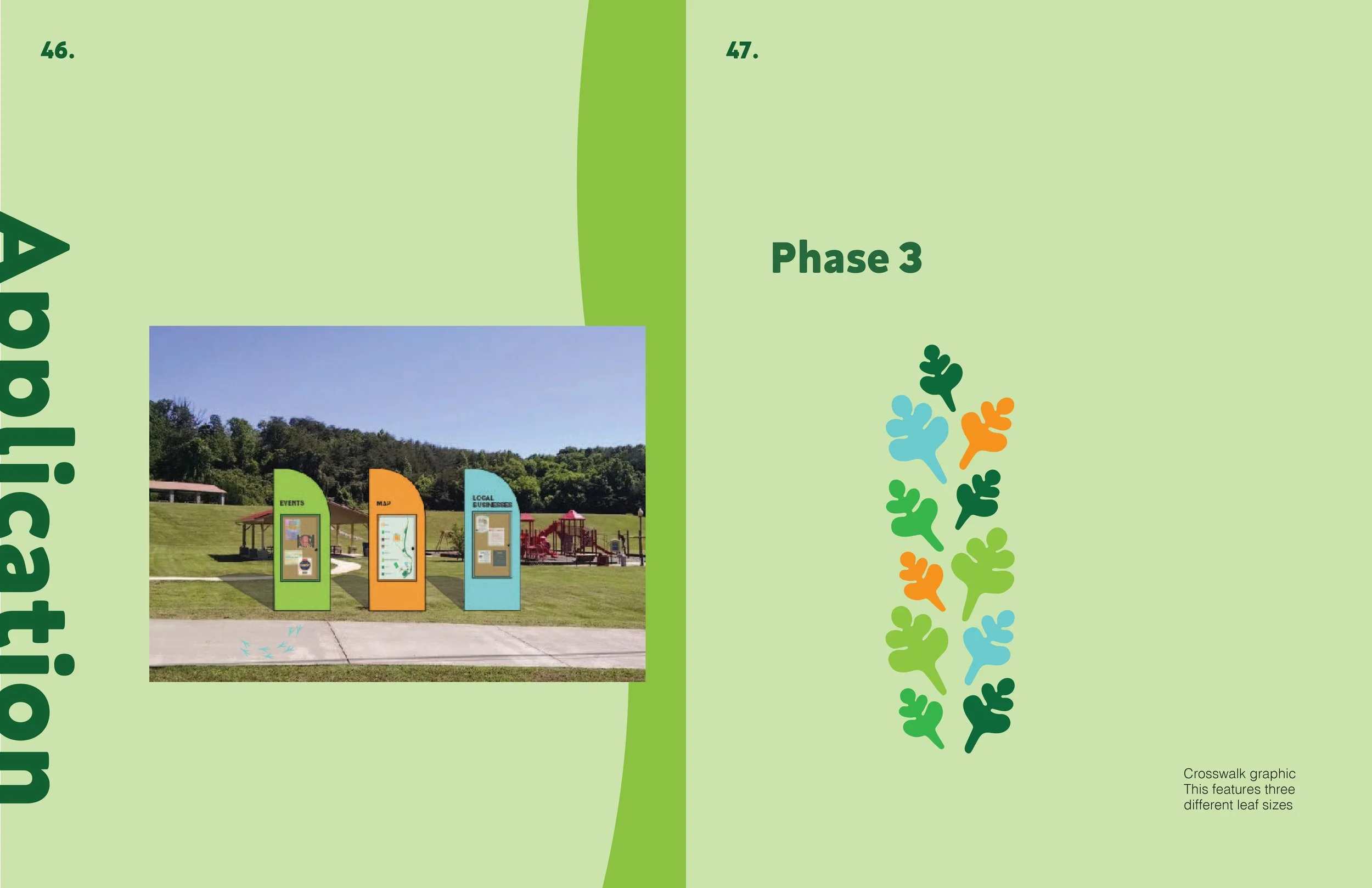
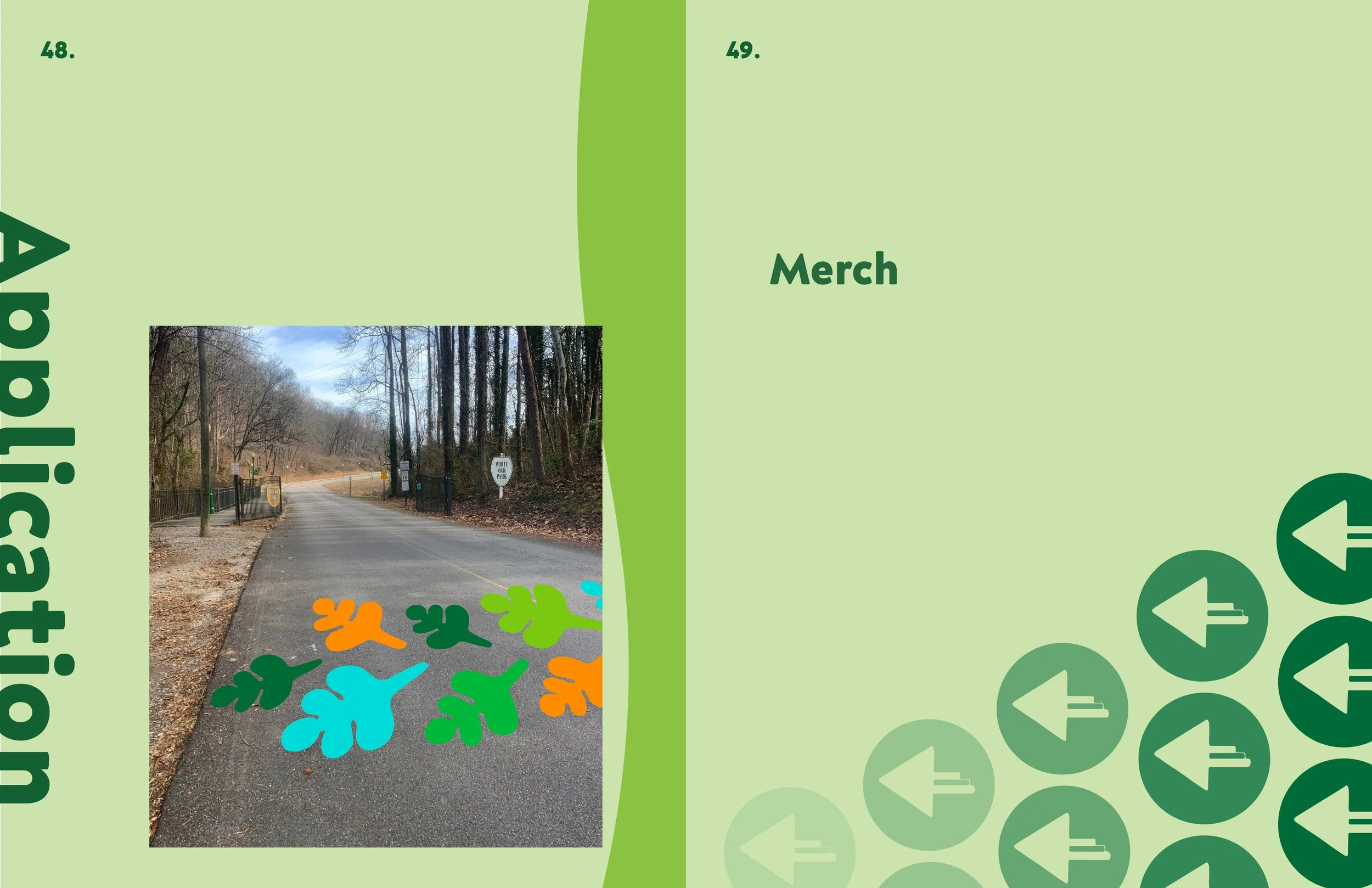
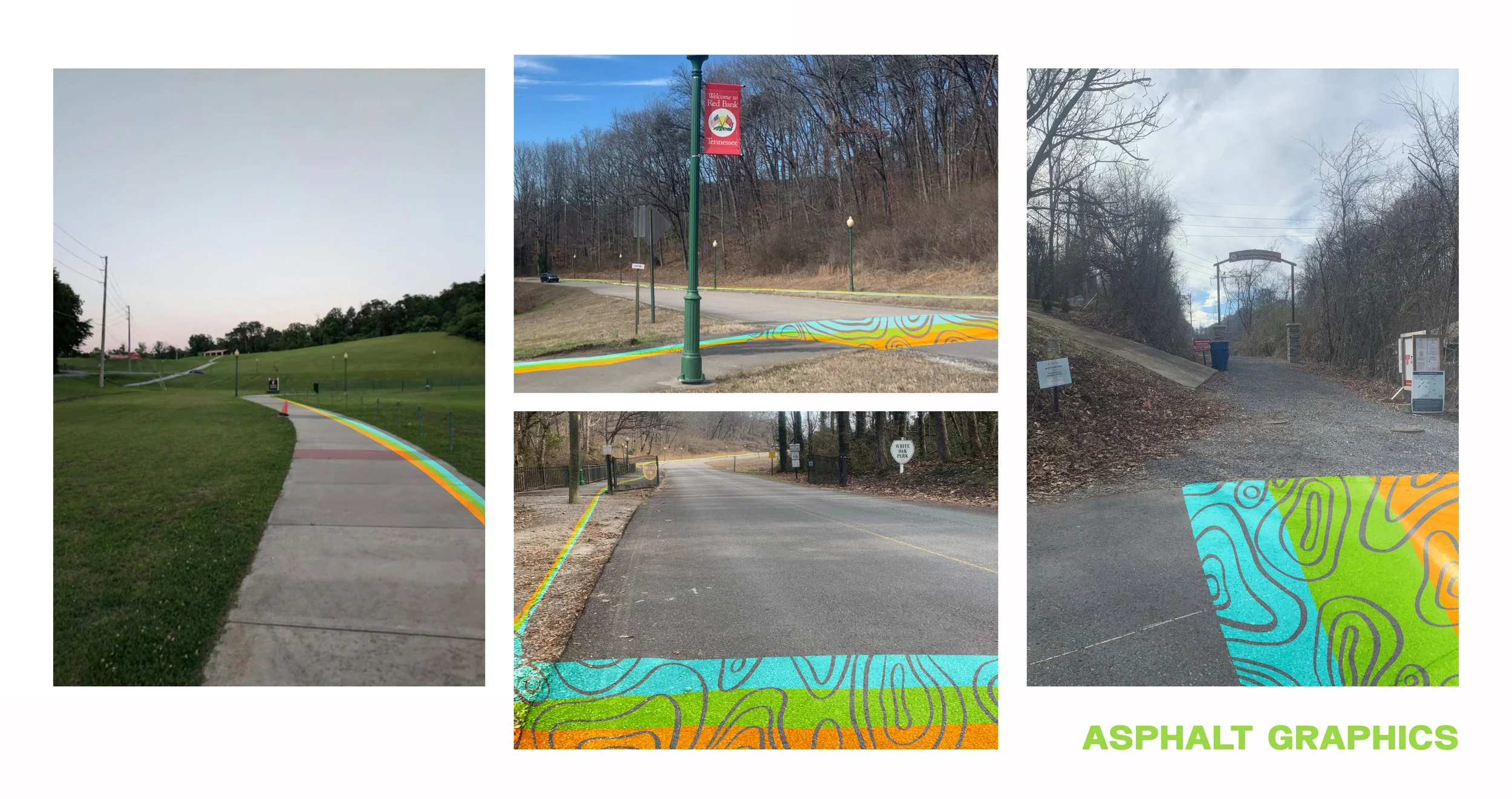
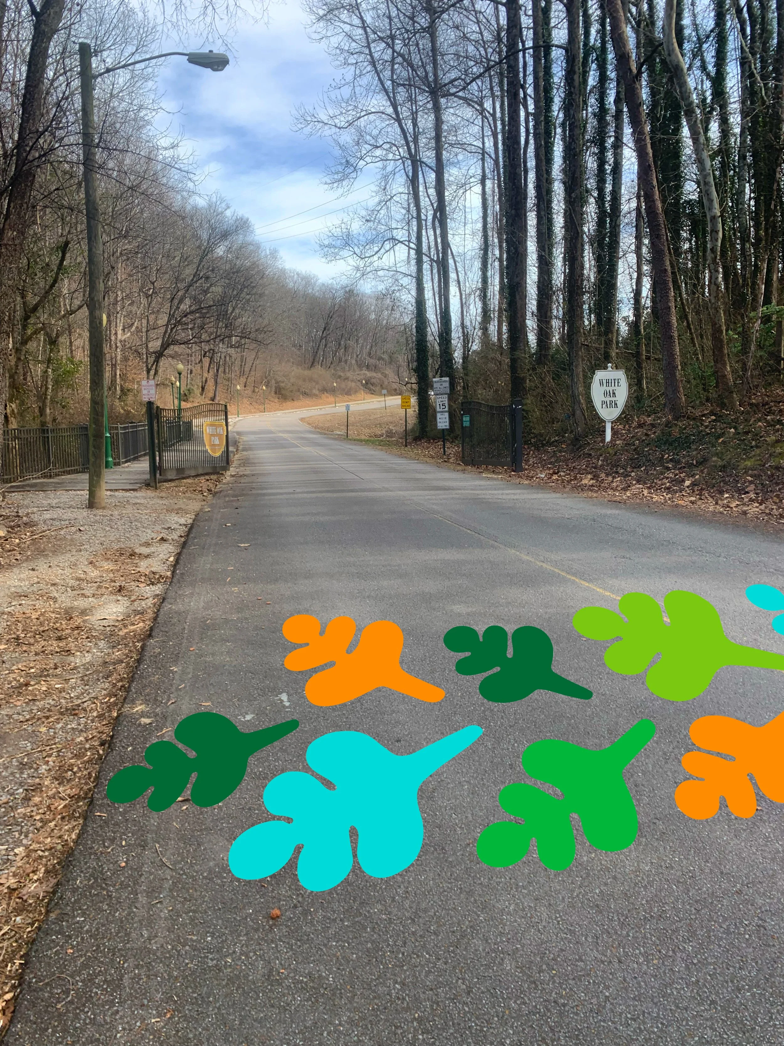
Asphalt Graphics
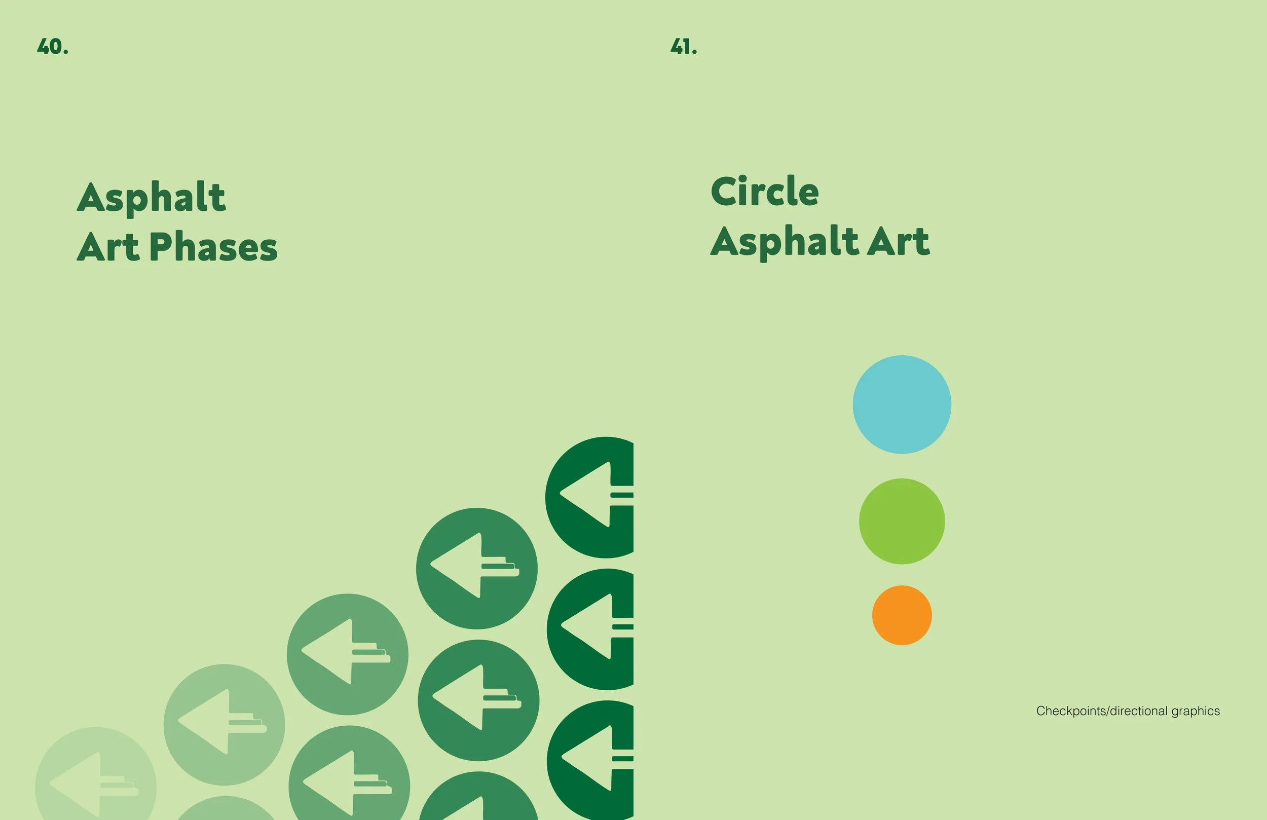
The inclusion of asphalt graphics was an element deemed imperative to effectively guide individuals towards the connector while concurrently enhancing safety at crosswalks by alerting drivers to the pedestrian zone. The choice to incorporate a paw graphic was influenced by the community commonly referring to White Oak Park as the "Dog Park." Similarly, the bird track graphic was derived from the educational content utilized in the card game, which formed part of the design package. The graphic style deliberately aligned with the other visual elements within the design package. To accommodate the client's financial budget, we presented three distinct phases, ranging from simpler and more cost-effective designs to more intricate and higher-priced options. Additionally, we provided information regarding potential stencil materials that would be utilized during the implementation of our designs.

Phase 1

Phase 1
Phase 2
Phase 3

Phase 3

Phase 3
Style Guide Booklet: Designed by the team